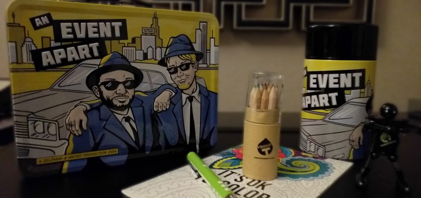
I just returned from An Event Apart, a web design and development conference. This year was their 10th year of the conference (in Boston, Massachusetts). The conference is held in multiple locations throughout the US and each conference is slightly different. And let me tell you – it was amazing.
Day 1
Jeffrey Zeldman – Designing with Web Standards in 2016
Yesenia Perez-Cruz – Designing Deliberately
Jen Simmons – Revolutionize Your Page: Real Art Direction on the Web
Rachel Andrew – CSS Grid Layout
Josh Clark – The Physical Interface
Ethan Marcotte – Design Beyond Our Devices
The first day was packed with talks, a lot of small breaks (with yummy treats), a great lunch, and a lot of excitement. All the speakers were energetic and engaging. It made the day go by quickly. My favorite talk was CSS Grid Layout by Rachel Andrew. As a web designer, I was particularly excited about the possibilities for using CSS Grid Layout and can’t wait until it’s implemented across all browsers.
Day 2
Jeremy Keith – Resilience: Building a Robust Web That Last
Eric Meyer – Compassionate Design
Derek Featherstone – Extreme Design
Cameron Moll – Unified Design
Lara Hogan – Designing for Performance
Gerry McGovern – Top Task Management: Making It Easier to Prioritize
After an amazing first day of talks, everyone arrived eager to learn more. The day itself was similar to the first day – lots of talks, small breaks, a great lunch, and a buzz of excitement.
But then, we were sucker punched. Eric Meyer opened his talk, Compassionate Design, with a story about his daughter, who died when she was only 6 years old. A few months after she died, Facebook sent him a reminder of a photo he took of his daughter, with a cartoon motif of people celebrating and the line, “Eric, here’s what your year looked like!”. This hit me especially hard. My son died when he was only 14 months old. And while I love looking at his pictures, I hate having it shoved at me with happy little cartoons.
His talk proceeded to discuss the merits of designing with the users in mind – What gender are they? What race? What age? What do they want? How do they feel? – but what if you’re wrong? In this case, Facebook was wrong – Eric didn’t want a year in review reminder. And there’s no way to opt out of it.
The rest of the talk focused on thinking about the potential worst case scenarios for your design and while you may not get it right 100% of the time, at least plan for the worst (but hope for the best).
Day 3
Josh Clark – Designing Exceptional Mobile Experiences
The third day was a full day of one talk, Designing Exceptional Mobile Experiences, from Josh Clark. Mobile usage has increased but designing for mobile devices mostly has not. More searches are being done on mobile devices than desktop computers. But the mobile version of a website is usually a pared down version of the desktop version, with many features missing. This talk focused on designing for a variety of screen sizes rather than just making a site and scaling down. The platform can also affect the user experience so please take this into account. For example, maybe the menu makes more sense at the bottom of the screen on on Apple device but doesn’t on an Android device.
And of course, sell Beyoncé whenever you can because Beyoncé can sell anything.


